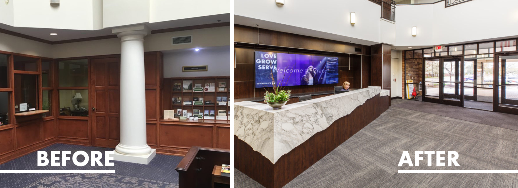
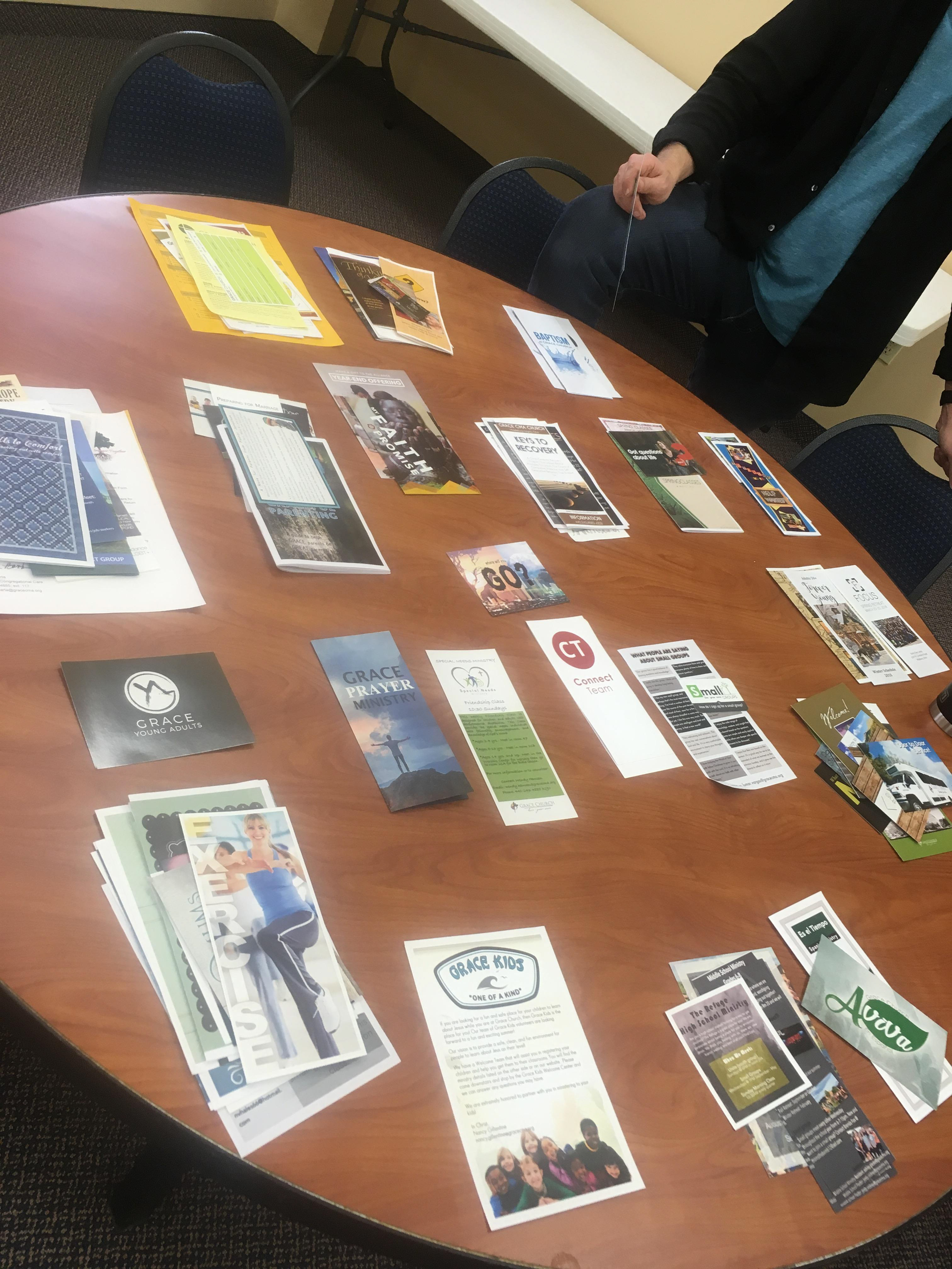
BEFORE
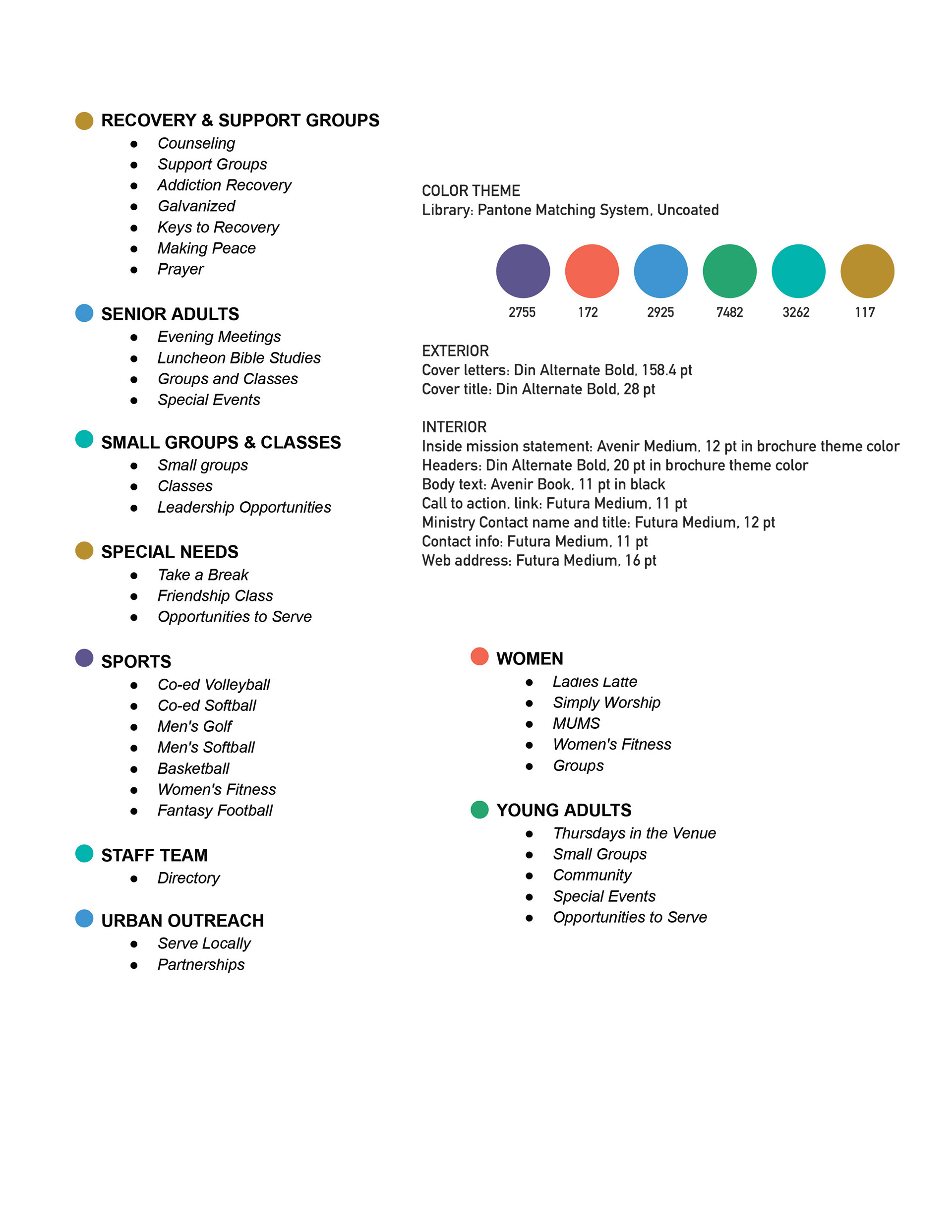
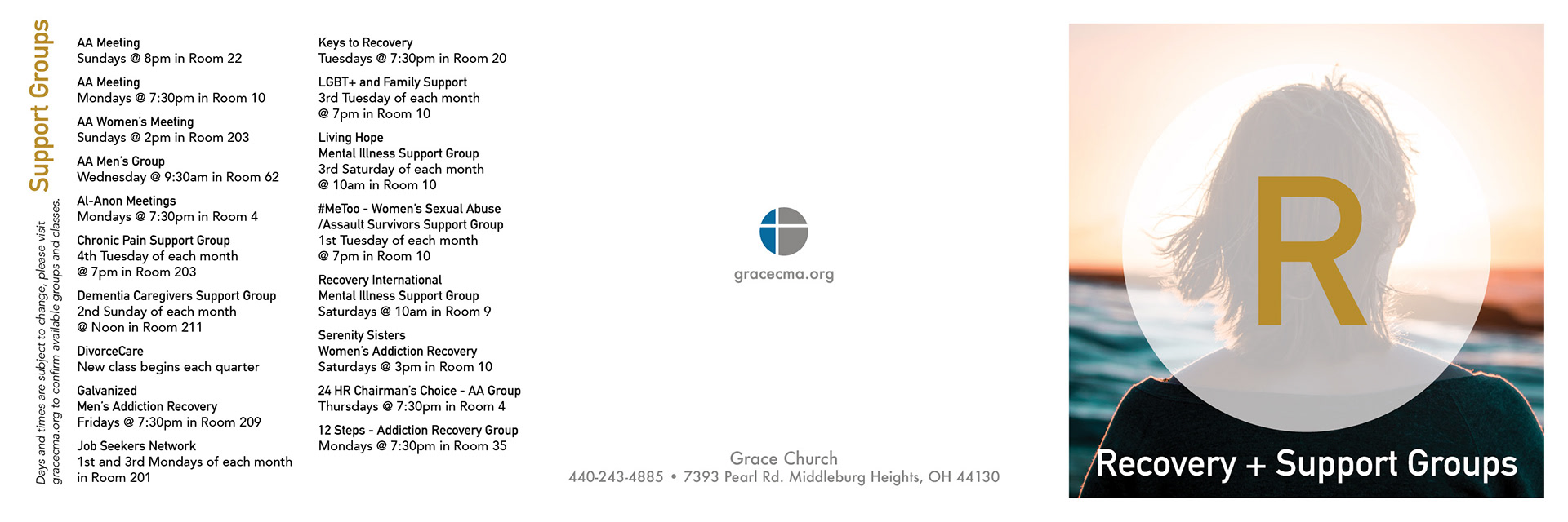
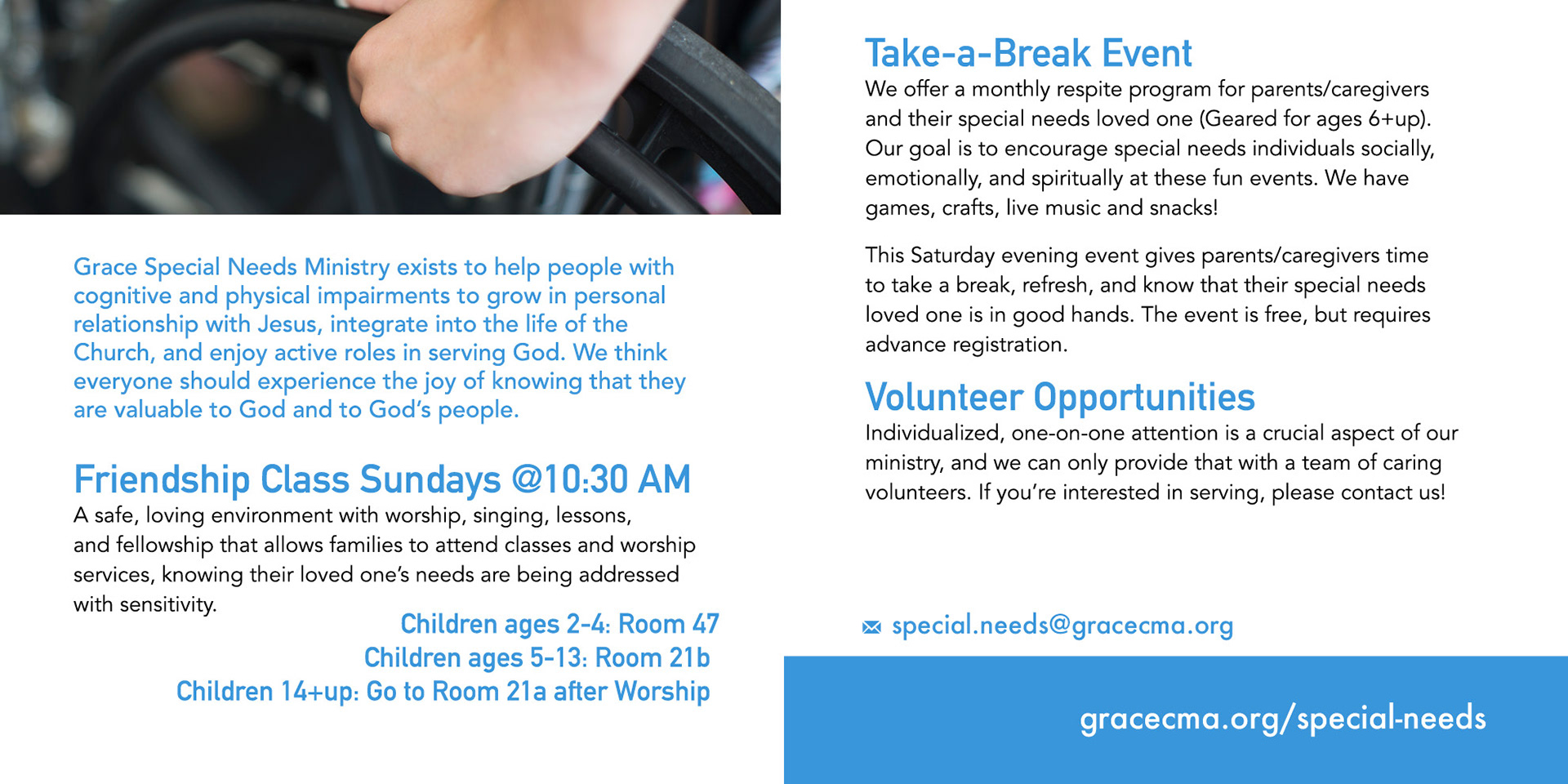
At 12' x 6', the information shelf covered the better part of a wall near the main entrance. It was stuffed with brochures for ministries and services offered by the church, none of them visually alike or strongly moderated.Over several months, I coordinated with each of our ministry department leaders to find out which events and programs might fit together under a shared category.
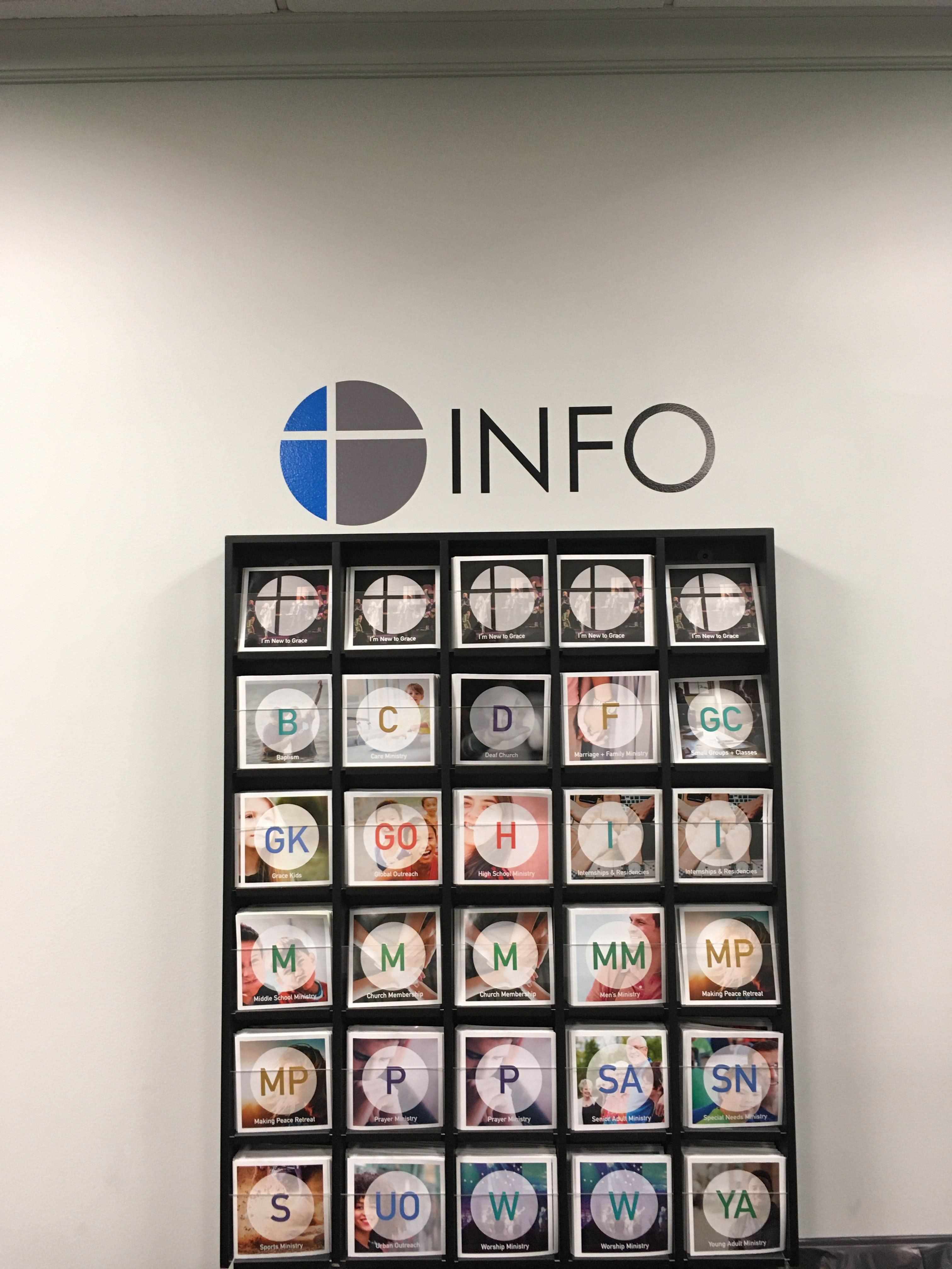
AFTER
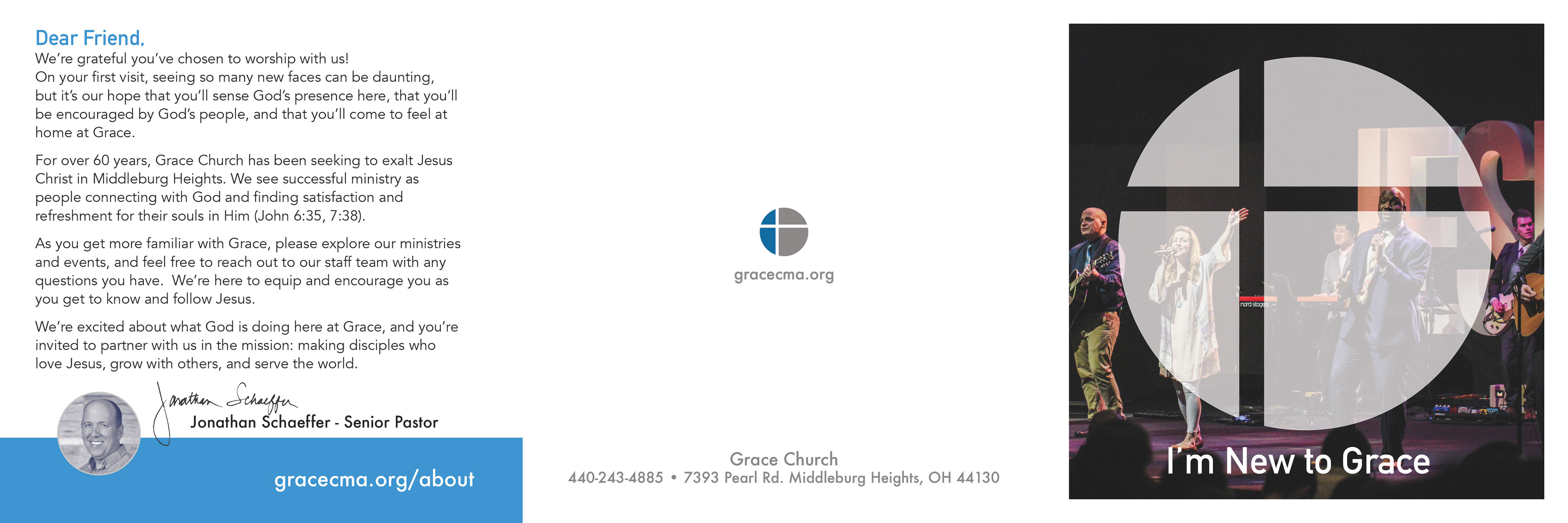
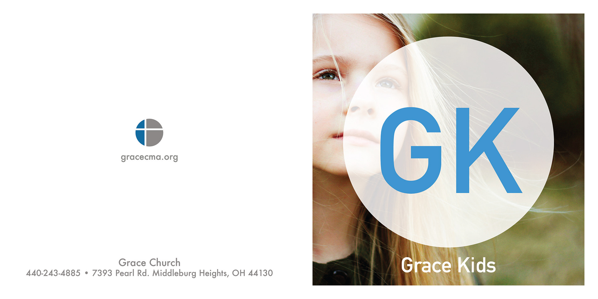
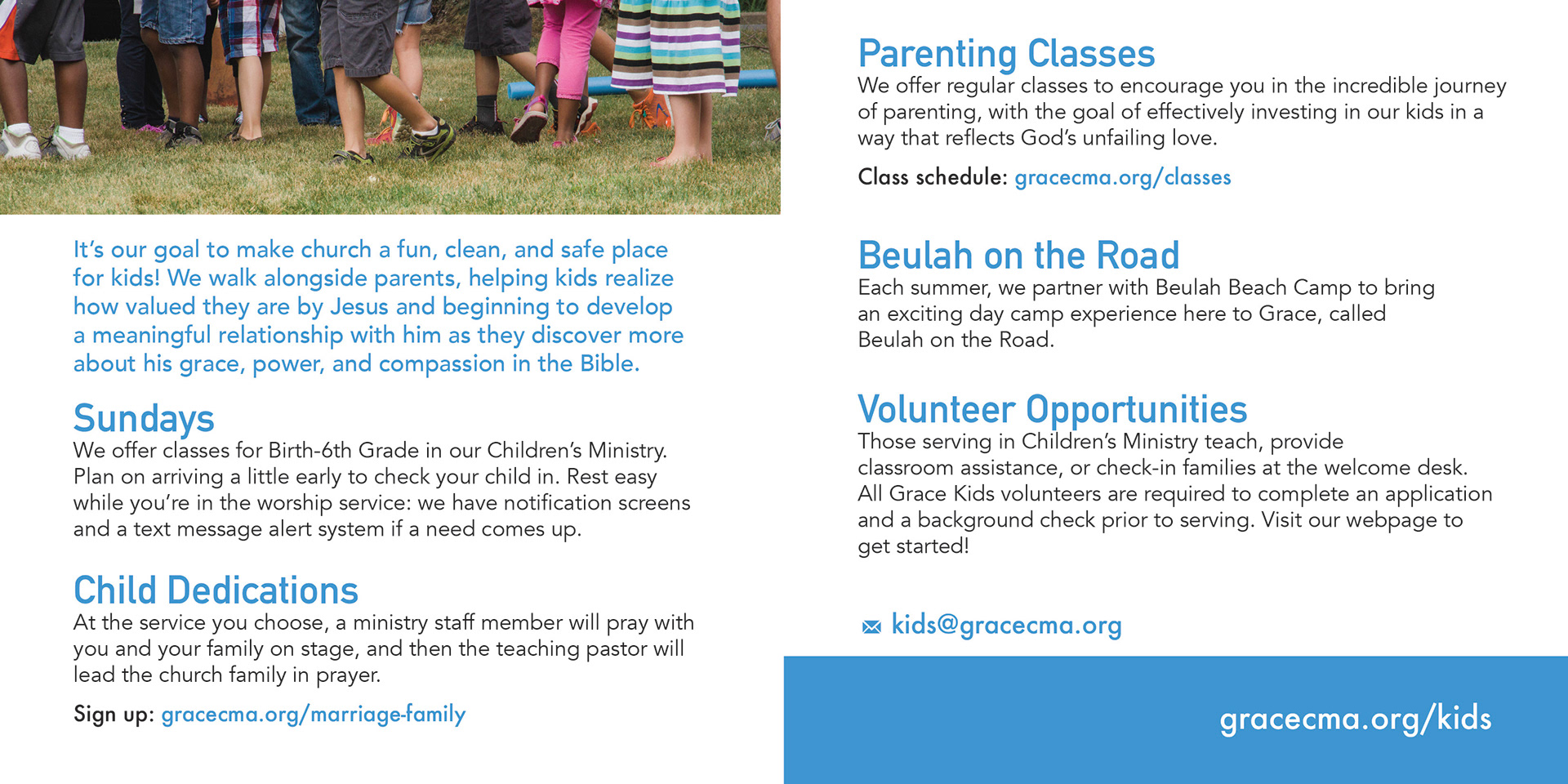
At the close of the project, each category had it's own brochure. Having the ministries share space in a brochure meant that guests could easily find the life stage or interest they were looking for. The result was a simple, inviting takeaway piece that pointed them directly to our website to learn more.
THE WINS:
• We saved financially on in-house printing and work hours.
Administrative staff no longer needed to print on demand to restock brochures for more popular ministries. Because the information in their brochure remained static, not event-based, we were able to print them locally at a better quality while saving on the price per piece.
Administrative staff no longer needed to print on demand to restock brochures for more popular ministries. Because the information in their brochure remained static, not event-based, we were able to print them locally at a better quality while saving on the price per piece.
When the brochures were sorted into a clear and inviting shelf, we discovered that many guests were satisfied to browse the brochures to explore ministries, and then replace them on the shelves. They preferred to connect to the ministry later online. Knowing this encouraged the team to be less concerned with print materials, and more proactive in updating the event calendar on our website.
• We had a unified visual branding.
Up until this point, the varied designs of the brochures conveyed the idea that we were a house of brands, rather than a branded house. The redesign made a clear statement: we are one church that ministers to the needs of many different people, not a church of ministries.
Up until this point, the varied designs of the brochures conveyed the idea that we were a house of brands, rather than a branded house. The redesign made a clear statement: we are one church that ministers to the needs of many different people, not a church of ministries.