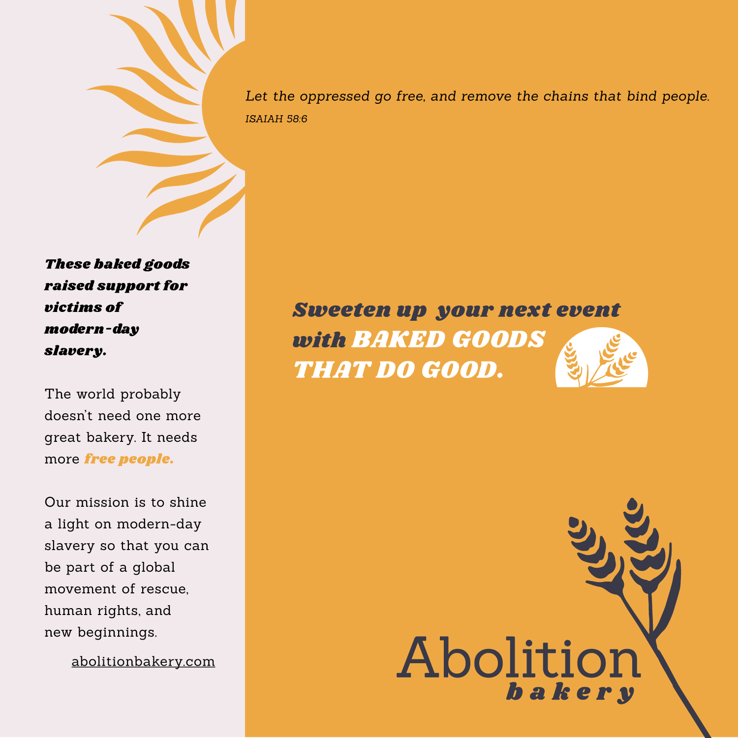
I received a referral for a client who runs a successful home bakery business with a big heart.
A portion of all proceeds from her business are donated toward organizations serving survivors of human trafficking. This is a cause that I am also passionate about, so I was excited to get to take a look at her branding, and see where we had room to grow. Ultimately, the client decided to maintain her original logo, however, there's still a lot to learn here.
This is a great view into my process of assessing your branding, and creative suggestions that can strengthen both it's longevity, and its tie to your business mission.
Current Branding
A great logo is a flexible one.
You can rearrange it’s elements and still recognize that it belongs to you!
You can rearrange it’s elements and still recognize that it belongs to you!
What could be better . . .
The wheat illustration in this logo is highly detailed, and it stands out quite a bit from the crisp shapes that make up the sun, its rays, and the emblem behind the text.
When your logo gets smaller, the thin white and black lines in line art like this become more difficult for a printer to achieve, and a little less easy on the eyes.
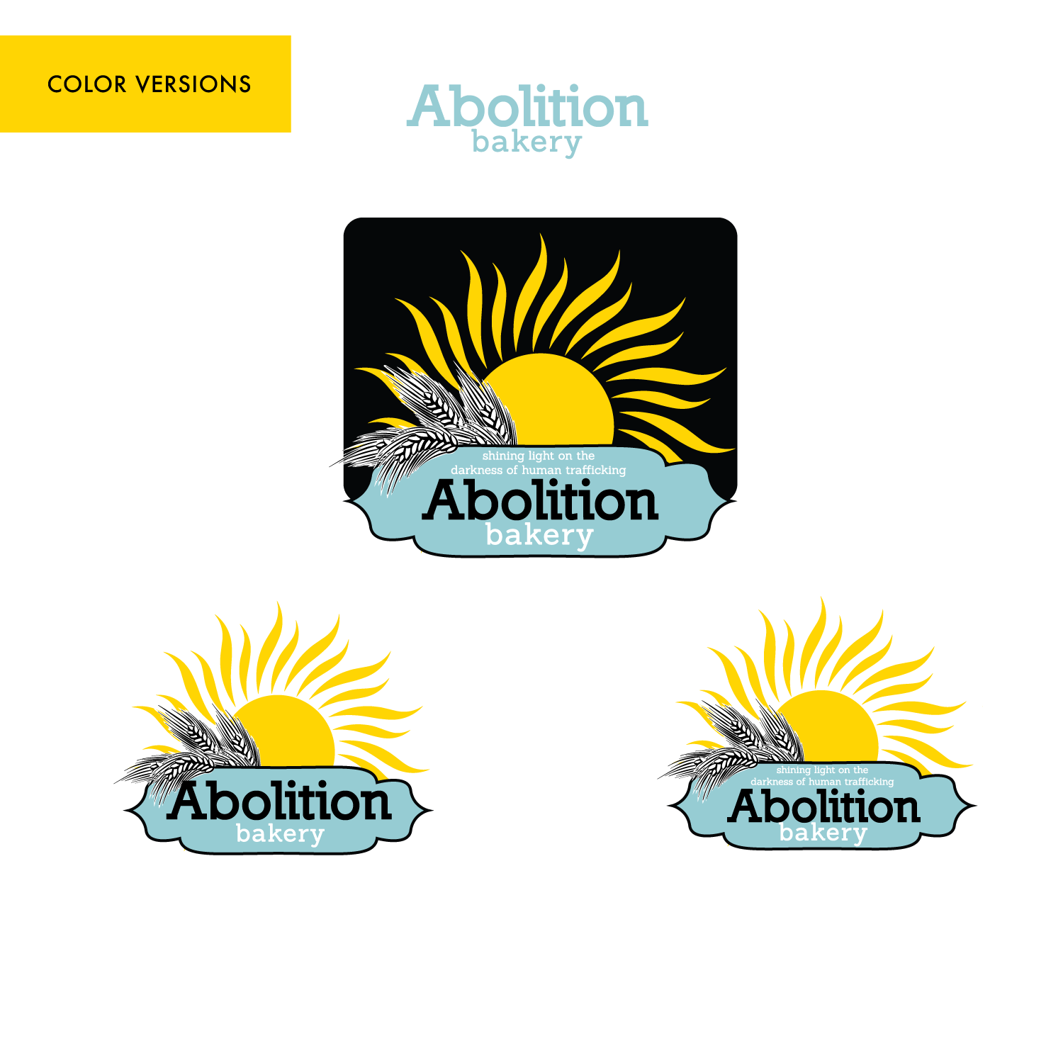
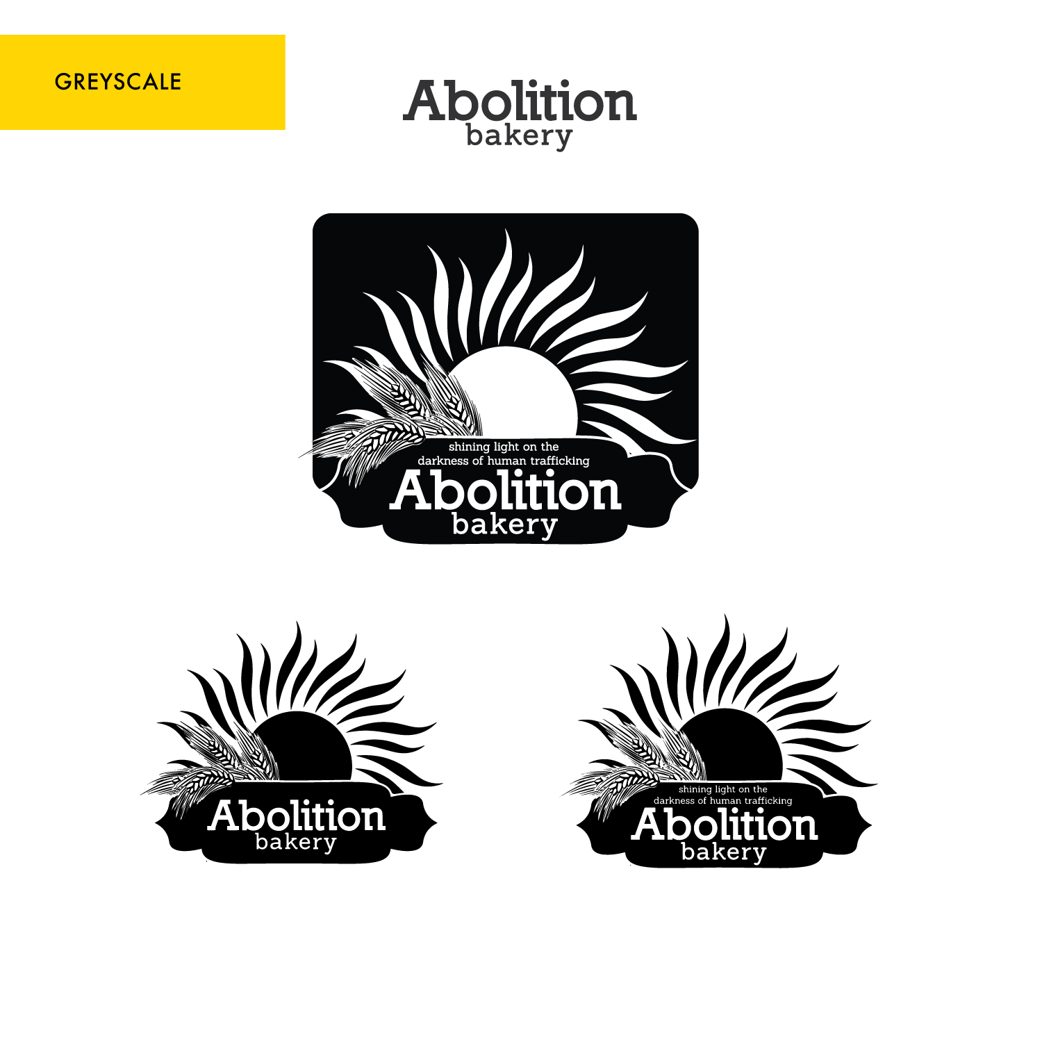
Having a logo that works in one-color and on a dark background is essential.
When you’re looking into t-shirts, aprons, or any printed items, 1 ink color will be less expensive to print than 3 colors.
Whether you decide to explore printed packaging, or wish to layer your logo over top a photo on your website, a flyer, or a social media post, you’ll have everything you need.
What could be better . . .
Ideally, all the elements of your logo should be able to function independently.
Because the emblem and the wheat overlay are connected, it doesn’t have this kind of flexibility.
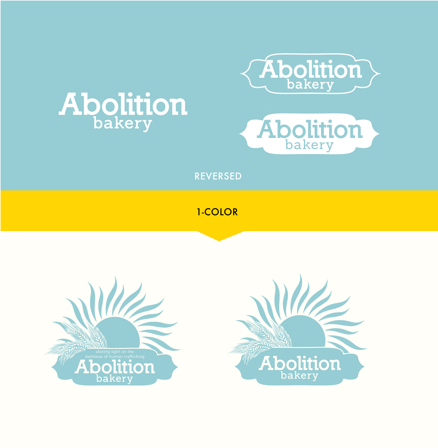
You don’t always have to print in color. After all, newspapers don’t.
I always recommend having this on hand for things you only want to print in black and white. Print it on some teal blue paper in the printer, and you’ll still be using your branding colors! It is of course also helpful if you ever wish to place a newspaper ad.
I always recommend having this on hand for things you only want to print in black and white. Print it on some teal blue paper in the printer, and you’ll still be using your branding colors! It is of course also helpful if you ever wish to place a newspaper ad.
What could be better . . .
You can see more noticeably in this version how the tiny lines in the wheat and the tagline are starting to disappear at a smaller size.
Proposed New Branding
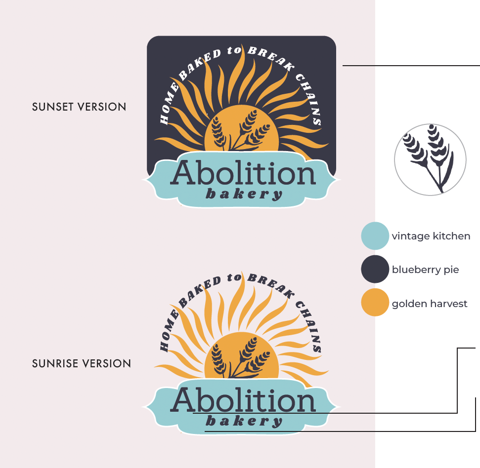
This new logo wears its heart on its sleeve, with a strong tagline arcing over the sun.
• The new wheat illustration still has a charming hand-drawn feel, but it fits well with the other elements, and it’ll scale up or down without losing detail.
• Branding colors have been warmed up with a golden orange sunrise, and no more black backgrounds.
• Fonts are clean but nostalgic
Your primary typeface gives a wink toward the original, but less heavy, and bakery is now in a comforting italic font that makes the logo feel both modern and timeless.
Your primary typeface gives a wink toward the original, but less heavy, and bakery is now in a comforting italic font that makes the logo feel both modern and timeless.
The sky is the limit!
This new logo has a strong impact, even when you start to isolate its pieces.
• The wheat silhouette holds its own
or in different layouts for when you need a simple, recognizable landscape option.
or in different layouts for when you need a simple, recognizable landscape option.
• You can use this logo-mark without the emblem shape behind the text, and even remove the tagline when you need to.
• The new fonts give you great options for text only versions that are unmistakably your business.